15 Apr 2011

Magazine Evaluation

Jack Beedle


Media Evaluation


How does your media product represent particular social groups?


I think the image that I used on my front cover really represents the type of person that I think would read this magazine. I didn’t want young people to be stereotyped in this magazine. Erica has the rebellious rocker look but I don’t think this perceives a younger generation in the same way. I think the audience will know that Erica is an adult and she is doing her own thing and not trying to fit in with the crowd. On the other hand, it kind of does represent the whole 16 – 25 category in the ‘younger generation’ band therefore a social group of younger people could be being stereotyped as all of the same type of person.

This being said, there are young people who don’t fit this image or don’t like this type of music and wouldn’t buy this magazine that would hit out at the publication for being too stereotypical if younger people but that is not what I am trying to show. I am trying to show a particular representation of the people that actually would buy this magazine and not everyone else.


Who would be the audience for your media product?


The main target audience that I have chosen to target is 16 – 21 year olds with another larger audience maybe ranging to a maximum of 30 years old. This is because I don’t think that that many people over the age of 21 would buy this magazine but it might attract to a few people that are over the age of 21. Also, this is the magazine’s 24th issue and people who were 21 at the time of the first publication may continue to buy the magazine if they like it. The target audience that I chose had to affect the price of the magazine that I chose. It had to be relatively low since the income for most 16 – 21 year olds (16 year olds, certainly) may not be enough to fund a magazine that costs £3 weekly which is why I have chosen to sell my magazine at £2.20 for a two week magazine which is a figure that, I think, doesn’t look daunting to young people. I would have chosen to make it a monthly magazine priced at £3 per issue but since there are so many other music magazines out there, I think that not issuing anything for a month is too long. Other magazines will get their information out faster than you and people don’t want information that they have read weeks before. I think weekly is too often but monthly isn’t often enough so I think bi-weekly suits my publication best.


How did you attract/address your audience?


To attract my target audience with this product, I knew it would have to be something eye catching and bold to make it stand out quite a lot. I decided to use orange and black as a house style and is a running theme throughout my product. My model is wearing red and black which was the original influence for that. The target audience is young so I wanted the person on the front cover to represent young people which is why I chose my friend Erica. She already has the kind of rock look that I was going for and she is the type of person that I am marketing my magazine at. The image needed to make a statement so I had her grabbing her hair and making an angry-ish face which a lot of rock stars do but then I didn’t think she looked rock enough. She didn’t look like the rebel-y character that I was trying to pass her off as which is where the orange fringe came from. The idea initially came from the house style of black and orange but then someone suggested to me that it was Hayley William-esque (lead singer of rock band Paramore) which solidified my thinking that this was a more rocky look.


What have you learnt about technologies from the process of constructing this product?


Technology can be used in many different ways to aid the magazine world. You can now put your magazine online to reach a wider audience, using websites you can generate more hype and get the product out there more and, ultimately, you need technology to create the product. Before looking at this task, I don't think I fully understood the power of having an online magazine. It is quite similar to the actual magazine but they only mostly give enough to whet the appetite to make you want to buy the magazine in hard form. They also allow you to create a membership to the magazine to get you things like discounts, email alerts, etc which make you feel as though you are part of the magazine group. This project has also taught me quite a bit about Photoshop aswell. Before starting media at this college, I already knew my way around Photoshop quite well but I was quite samey in the styles that I used in my work. I knew what changes to the images would look good so I used these effects quite often and whilst editing the images for my music magazine, I explored Photoshop quite a bit more than I usually would and I have discovered things that I knew were there to use but they were things that I had never thought of using in the ways that I did before.


Looking back at your preliminary task, what do you feel you have learnt in the progression from it to the full product?


I feel like I have learnt a lot more about audience research for the product. When I first did the advertisement task, I didn’t really think about creating an advert that would appeal to a specific audience, I just created something that wasn’t specific to anyone. It was just an advertisement designed to appeal. When we created the magazine for the college, obviously, the target audience was mainly college students which was quite easy to get the audience research for. But when creating a music magazine, the audience is slightly more broad than the college magazine so I also sought the advice and feedback of adults that may also read the magazine since it is mainly aimed at young adults.

How my magazine uses typical conventions of a Rock Magazine: Masthead The masthead of my magazine is bold. Usually, mastheads stand out from the background and are eye catching. Mine is a bright orange on black using a shattered glass/scratchy font. This gives it the rock connotations that gives the impression that it is a rock magazine.

Final Magazine


14 Apr 2011

Change to front cover

I have changed the colour of the front cover image so that the temperature of it is a colder colour so it matches the other two images. The background image is now more blue but the other features of the page (the orange) are the same colour.


12 Apr 2011

Changed Double Page Spread after feedback


The only thing I have changed about this one is the colour of the quote above the interview.
The magazine looked better with the quote but the teacher didn't think it looked right in orange so I changed the colour to black so it looks better.
The only thing I am not sure about is the interview introduction on the left hand side.

21 Mar 2011

More development on front cover using teacher feedback


I changed the typeface from Courier New to Soho Pro and I think it looks much better and is more readable than the previous one even though they are quite similar.


I used the original idea that I had to put the artists picture with a colour effect ihn the background of the name banner. She looks really angry here and I think it gives a good effect.


Now I am trying things with different coloured hair. Here and the image below are two different image effects:

I think I prefer the second one.

20 Mar 2011

Contents Page Drafts

1) My original photo was only very small and cropped to the top of her head so I changed the colouring, changed the contrast and edited the picture so that it has an extended background (like the double page spread)


 2) I wanted to keep with the house style and have my contents masthead the same as my front cover mast head. I kept the same colour, the same font and the same background so that there are references to the house style in the design.
 3) I changed my mind a decided that I wanted to have the contents page mast head on the same side as where it is on the front cover. Then I added the editors note below but was still unsure of it's positioning.
 4) I added in the editors name and title to keep with the conventions of music magazines.
 5) I thought adding a page reference on the picture of Erica was a typical convention as it is referencing where her article is.
 6) Some magazines use some sort of icon to indicate which of the stories in their contents are cover stories so I decided to use a star and then make it clear by using the key about the contents. I used a white rectangular background and faded it so you can still see the picture of Erica and the background even though it is covering it. It keeps with the house style even in the 'This Week title, except it is just inverted from the usual.

7) I thought the top of the page was too empty so I changed the top part to a banner and stretched the word Contents so it filled more of the top bar. This fills out the page and doesn't look as empty.

19 Mar 2011

Which looks better?

I would like some feedback on what people thinks look better from the two designs below:


(with a quote)


(without a quote)


If you can comment this with feedback, please do. Otherwise tell me in person :) or vote on the poll :)


Which Looks Better?


More double page spread development

1. Here I have kept the same kind of design for my double page spread. I thought that it could look like a more conventional double page by adding the two borders at the top and bottom. I have kept the 'Anthem Exclusive' heading from before but I have made it bigger this time and made it the same orange as everything else.


2, 3, 4. The three images above were two different ideas that I wanted to try. I tried three different ways with the word 'Erica'. When I tried it in red, I originally wanted it to stick out from the rest of the double page but then I realised that it looked too out of place and didn't fit with the house style. Then I tried it in orange which did fit with the house style but then it blended in too much and I think it looks like there is too much orange on the page. Then I tried both words in black (4) and I think it really works a lot better than the first too and still fits in with the house style.

5. I decided that I wanted a quote underneath the artists name so here I was just trying out what it would look like with the quotation marks.
6. After being quite pleased with my previous look, I realised that if I folded the image, the artists name would be cut between the centre of the page. I didn't want this to happen so I had to make the artists name smaller which actually worked in my favour because it meant that I had more room to fit in the quote and the interview
7. Here is my magazine with the quote below. I am not sure if I like how this looks.
8. Even though I don't like the quote, here is my magazine with the article. I would like to get some feedback on whether people think it looks better with or without the quote.
9. This is my final draft. I wasn't sure about the article introduction at the side so I have added another post with two versions that I will get people to give me feedback on.

17 Mar 2011

Teacher Feedback on drafts:

Feedback on Front Cover:
  • Good pose and good colours
  • Interaction between the model and the masthead (the way it's placed behind) is good
  • Hard to read the writing in courier new (make it bold)
  • Need 2 or 3 cover stories
  • Add barcode
  • Enlarge masthead (possibility)
  • Crop the image to her arm (at the side; right)
Feedback on Double Page Spread:
  • House Style is not clear
  • Reference Anthem (in the masthead)
  • Reference her name (in the masthead)
  • Quote her
  • Font may not work
  • Put quote over her?

2 Feb 2011


Here is where I have cut out the corner of the image to prepare for putting the masthead underneath her arm.


To do this I duplicated the original layer, put the text in the then put the text layer underneath the duplicate layer which gave the ability for me to have the text under her arm.


Here I have added a banner to the bottom of my music magazine and magazine information in the corner of the magazine.


Here is where I have added on the artists name so that you know who it is.

Double Page Spread development

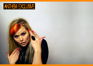
1. This is the original image for my double page spread. The image was originally much smaller than this but I cropped the side of the wall and pasted and editted it so that it made the image look bigger than it actuall was. Here I have no edittedtheoriginal image in any way.


2. In this image I simply changed the contrast of the image. I like the model being more contasted but I now don't like the colour of the background.

3. Here I editted the previous picture and changed the colour and the tone. This has given it a more cold, isolated look which rockstars usually go for.

4. Here I have editted the model. I edited any parts of the picture that may have had camera flash on (such as the ring and the nails) and I also edited some of the model's features such as cheeks to make them more defined and eyes to make them less baggy.

5.I realised that there would be continuity errors in my magazine if the model had an orange fringe on the cover and she didn't anywhere else so here is where I readded the orange fringe usuing the overlay tool in photoshop

6. The double page spread had to show some of the magazine's identity so I added a small header in the corner saying 'Anthem Exclusive' to make it look like a more conventional doble page spread.

7. I didn't like the last small header that was in red so I made it bigger and changed it to orange. I like this version better than the one before. Here I started to add my article.

7 Jan 2011


Skratch is the main font that I have chosen to use in my music magazine. I have used it in my masthead and it is probably the first thing that is seen when people look at the magazine. I chose it because it is bold and in your face and actually looks like a rock-y type font.


Courier New Regular
Courier New Regular is the font that I decided to make the main typeface for all of the regular text in my magazine. I have used this for the peformers name, the date; issue number and price, and the text on the bottom banner with the 'plus' section.


Throw My Hands Up In The Air is the font that I used for the text 'America' in the artists name. I wanted it to look like the artist had signed the page so it would ideally attract her fans who would all love to have her autograph.
6 Jan 2011

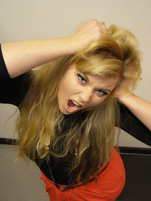
Image used for front cover


This is the image that I have decided to use on my front cover. My house style for this magazine will include use of a lot of orange and black which is what the model is wearing. I am also thinking about editting the features on the model. I am thinking about possibly changing the colour of her hair to make it seem like a real rockstar image.
I am thinking about maybe putting the mast head as a banner across her arm because it would be a great place to put the text. Other places to put it would probably be just in the top left hadn corner.

5 Jan 2011

Images I decided not to use

This image is the first image I took. I quite like the pose but the hat is shadowing the face and I didn't notice this when I was taking the pictures. To be honest, I don't reallyt like the hat at all. I don't think it goes with the look that I am going for. The body warmer, however, I think does look good but I still don't think it fits in with the image that I am going  for.

In this image, we got rid of the hat and I think it improves the shot already so much. Her face is still shadowed but I could probably edit that out in photoshop. Her facial expression is perfect. She is pouting which gives her a hard look.

I like the pose in this picture but I don't really like how close it is. It shows that she is mean and rocky but because of how close it is means that I cannot use it as a main cover image or a double page spread image. It could be used as a small picture in the contents page but this could be decided later on.

This image with the biting of the beads was just a pose that the model came up with randomly. I like it because it shows that she is fiesty and rocky. The problem with these wide-shot pictures are that they are too far away to use as a main image, when they're cropped they are too small and when they are zoomed it makes the image lose quality.
This image originally was an idea for the double page spread. That was the reason that I shot it off centre. This will be a really good image to use as the double page spread image because I could easily edit the background to extend it as far as I need it to add the article. Thinking about it now, I could have shot it off centre so the model was on the left because most magazines usually have their model on the left. If I really want to use this image, I could flip the image so that she is on the left.

This look reminds me of a look that someone would pull if they were really offended. This is showing the outspoken character of the artist and implys that people probably usually speak out of turn not in her favour and people probably say a lot of offensive things about her and her music.

This image shows the model looking over her shoulder with the same shocked look on her face as before. This looks as though she has almost done a double take in shock of what has just been said to her. I made sure that I got the ring into the shot as it is in all of the other shots so I wanted it to be a kind of token thing in each picture.

Here she is pulling the typical rocker pose. The facial expression isn't quite right here. I like the pose overall but her face looks mid-expression. If it had been angrier and not as though she was about to laugh, it could possibly have been used as on the cover.


Here she is pulling the moody look which is right for the kind of rocker style but really that needs to be an angry/mad look but here she just looks really moody and as though she's really annoyed and it's not quite the type of look that I'm going for. I tried to shoot this picture leaving the space above the image incase I would need to use that space for anything else, such as the contents page. This is an idea that could be editted into other pictures to make them look the same.


I originally planned to use this picture on the cover but then I decided that the model was a bit too in your face. I want the cover to be in your face but her face is actually too in your face so I didn't think it would loom right on the page. If her face wasn't as close to the camera it would have been a great picture to use on the cover.

This picture would have been good for the double page spread if the facial expression had been angrier or meaner. The way her hip is popped to the side is good and the different colours in her hair look really rocky too.

This is a development of the picture above. I thought with the hair on the left of the picture being pulled down it looked too innocent but as I said above, the facial expression is too nice and it isn't as shocking as it needs to be from a rock star.


I thought it would be nice to try and use this frame as a prop and see what the outcome was. Collectively, I like all of these framed pictures. We tried some looking at the camera and some looking away. We also tried the frame in different positions. I really like all of these pictures and they could have been used as double page spread pictures but I don't think there will be enough space to add the text and putting a layer over one side to fade the picture could be slightly off putting and inconsistent so I don't think I will be using these at all in my magazine but it was a nice idea.