21 Mar 2011

More development on front cover using teacher feedback


I changed the typeface from Courier New to Soho Pro and I think it looks much better and is more readable than the previous one even though they are quite similar.


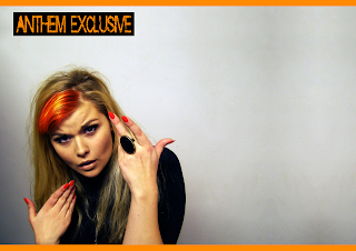
I used the original idea that I had to put the artists picture with a colour effect ihn the background of the name banner. She looks really angry here and I think it gives a good effect.


Now I am trying things with different coloured hair. Here and the image below are two different image effects:

I think I prefer the second one.

20 Mar 2011

Contents Page Drafts

1) My original photo was only very small and cropped to the top of her head so I changed the colouring, changed the contrast and edited the picture so that it has an extended background (like the double page spread)


 2) I wanted to keep with the house style and have my contents masthead the same as my front cover mast head. I kept the same colour, the same font and the same background so that there are references to the house style in the design.
 3) I changed my mind a decided that I wanted to have the contents page mast head on the same side as where it is on the front cover. Then I added the editors note below but was still unsure of it's positioning.
 4) I added in the editors name and title to keep with the conventions of music magazines.
 5) I thought adding a page reference on the picture of Erica was a typical convention as it is referencing where her article is.
 6) Some magazines use some sort of icon to indicate which of the stories in their contents are cover stories so I decided to use a star and then make it clear by using the key about the contents. I used a white rectangular background and faded it so you can still see the picture of Erica and the background even though it is covering it. It keeps with the house style even in the 'This Week title, except it is just inverted from the usual.

7) I thought the top of the page was too empty so I changed the top part to a banner and stretched the word Contents so it filled more of the top bar. This fills out the page and doesn't look as empty.

19 Mar 2011

Which looks better?

I would like some feedback on what people thinks look better from the two designs below:


(with a quote)


(without a quote)


If you can comment this with feedback, please do. Otherwise tell me in person :) or vote on the poll :)


Which Looks Better?


More double page spread development

1. Here I have kept the same kind of design for my double page spread. I thought that it could look like a more conventional double page by adding the two borders at the top and bottom. I have kept the 'Anthem Exclusive' heading from before but I have made it bigger this time and made it the same orange as everything else.


2, 3, 4. The three images above were two different ideas that I wanted to try. I tried three different ways with the word 'Erica'. When I tried it in red, I originally wanted it to stick out from the rest of the double page but then I realised that it looked too out of place and didn't fit with the house style. Then I tried it in orange which did fit with the house style but then it blended in too much and I think it looks like there is too much orange on the page. Then I tried both words in black (4) and I think it really works a lot better than the first too and still fits in with the house style.

5. I decided that I wanted a quote underneath the artists name so here I was just trying out what it would look like with the quotation marks.
6. After being quite pleased with my previous look, I realised that if I folded the image, the artists name would be cut between the centre of the page. I didn't want this to happen so I had to make the artists name smaller which actually worked in my favour because it meant that I had more room to fit in the quote and the interview
7. Here is my magazine with the quote below. I am not sure if I like how this looks.
8. Even though I don't like the quote, here is my magazine with the article. I would like to get some feedback on whether people think it looks better with or without the quote.
9. This is my final draft. I wasn't sure about the article introduction at the side so I have added another post with two versions that I will get people to give me feedback on.

17 Mar 2011

Teacher Feedback on drafts:

Feedback on Front Cover:
  • Good pose and good colours
  • Interaction between the model and the masthead (the way it's placed behind) is good
  • Hard to read the writing in courier new (make it bold)
  • Need 2 or 3 cover stories
  • Add barcode
  • Enlarge masthead (possibility)
  • Crop the image to her arm (at the side; right)
Feedback on Double Page Spread:
  • House Style is not clear
  • Reference Anthem (in the masthead)
  • Reference her name (in the masthead)
  • Quote her
  • Font may not work
  • Put quote over her?