I obviously chose not to use them all as there are so many pictures but I will be giving my reasons for not using them here:
This picture was the text image for the front cover. I wanted to use an image with the college logo in the background but this was the best that I could get this shot whilst keeping a mid shot and keeping what I had in mind. This image was still a possibility but I knew that there needed to be more possibilities.
This image would have been quite good for the front cover as I like the position of the model and the placing of the Wyke logo in the background. The logo is level with the model's head so it doesn't make any of the photo disproportionate (it would have been this way if the model had been any closer to the Wyke logo, any closer to the camera, or any further away from the camera). Obviously it is up to me to direct the model where to go and get the photos that I want to use.
This is a variant of the other versions of this picture. I really like the picture as landscape but it wouldn't fit in a portrait frame. I could find some way to use it but with the designs for my front cover and contents page, landscape photos don't fit in with what I want at the moment. I basically just took this picture to test out and see what it would be like.
The next four pictures are pictures that I took to show camaraderie between students and to show students outside on the Wyke Campus. I deliberately took the pictures with the tree in the middle as I didn't want the space in between the models to be blank. I told the models to have a conversation and I took pictures around them.
I really like this picture and this is the picture that I plan to use on my front cover. I deliberately left space above the 'Oak' building sign so that I will be able to add in the masthead and possibly slogan.
Again, I like this scene. The placing of the models in front of the tree and still having the Oak sign in the picture make the picture look interesting and bright but it is a landscape picture so it would not work as a cover picture or picture for the contents page.
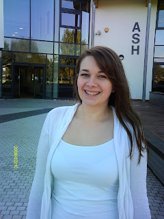
I would use this picture but the model is too far to the left of the picture. Ideally she would be right next to the Ash sign and now there is nowhere int he picture to put the contents list somewhere where it will look nice and not messy or forced.
I will not be using all of these pictures so I need to whittle it down and choose the best ones that will fit the designs that I have drawn. Editting the pictures I have taken will assist me in making the designs look nice. I am going to need to edit out the timestamps on all of the pictures as I could not find the function to take them off on the camera but this is easily done. If I change the contrasts and colouring on the pictures it will make them look bolder and more professional.


No comments:
Post a Comment